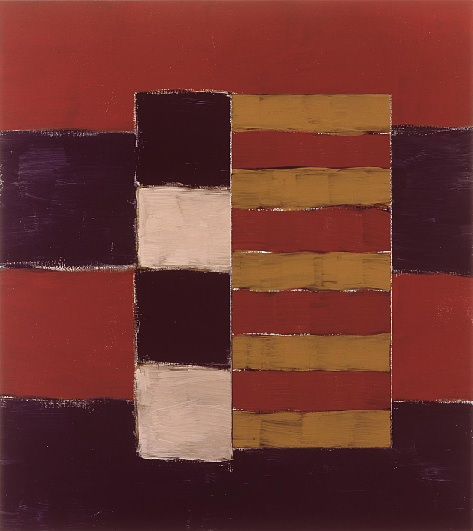


The series was fundamentally conceived as a celebration of the contribution of classic Greek culture to humanity. The works embody a metaphor of Greek architecture: “the spaces between the columns are space for thought, for light, for questioning and growth” writes Scully. The light and dark tones intervene in a complex game of solidity and shadow. There is no doubt Athens is the global inspiration of the series, but the role of Mooseurach –the countryside location of Scully’s studio near Munich– is also crucial. It was here that the paintings began, on a very particular wall which Scully grew to think was essential to the process, “…that’s where I would make the Doric paintings, and I would paint them into the evening when I could hardly see what I was doing. I like that clarity.” he explains. It’s striking that the gravity Scully sought for the Doric works was forged in the fading light of the Bavarian forest, that to evoke the city and people that he regards as the very cornerstone of humanity he needed not to be in the great metropolis, but surrounded by trees. There is a powerful emotional force in his literal evocation of sunset that remits us directly to the sensible spirit and the ambience of Doric Night and Doric Dusk (both from 2011). In the last works of the series, he employs a rich range of blacks highly superior to the one employed during many years; it reminds us of his black paintings from the mid to late seventies, product of a self-confessed “five year love affair” with minimalist art. As he explains: “The black paintings taught me to make the Doric paintings.” For Scully, black is resolutely a colour. He owes this to one of his artistic heroes, Henri Matisse, although there is also a clear link to the late black and gray paintings of another key influence, Mark Rothko. Another fundamental source is found in what Scully calls the “luxurious blacks” in the paintings of the seventeenth century Spanish artists, especially those of Francisco de Zurbarán. The push for austerity in the Doric series owes much to the Extremeño master’s expertise in using different tones of white. “It’s a very strange metaphysical relationship with materials, which is of course fundamental to all of my work –that relationship between materiality and light”. As with Zurbarán’s clerical robes, the whites in the Doric paintings are remarkably delicate in their nuanced hues. Rhythm is vital to the series. By 2009 Scully was growing increasingly frustrated by canvas and decided instead to paint on Alu-Dibond, a composite material consisting of two sheets of aluminium and a central core layer of polyethylene. Scully has likened the feel of painting on the metal to the percussion section of a jazz band, which inevitably prompts a hypnotic rhythm to enter into the marks he makes. Scully knew from the beginning that he wanted the Doric paintings to constitute “a big series which would be very centred and not include ramifications in other pictorial styles, that it were independent”. To achieve this he recurred to the pictorial experiences occurred during the major part of half a century, appealing to different moments of his own history and, as always, revisiting the work of artists from the near and distant past. The beginning of the Doric series is, therefore, at the same time an addition of these rich sources and an extraordinarily fertile new episode in the work of Scully. In respect to the series of water-colour paintings exposed that were painted in the decade of the eighties the artist wrote: “I spent a week on the island of Simi in 1984. As ever, when I travel, I look at the houses where people live. I looked at the buildings on Simi, and they expressed a clean simple monumentality. So I made a group of watercolours while I was there. The second one I made (8.10.84) was more or less a faithful view from a big bay window. I had rented an apartment on a cliff overlooking the sea. The terrace was flat and white against the blue and yellow of the sea and the sand. Most of these watercolours show windows and architectural inserts. Blunt geometric divisions, ending with Simi Morning, a pale yellow, blue, brown, white watercolour that I painted the day before I left. All affected by Simi. All reflecting a classicism that is embedded in the simplest of structures. And of course, there is the constant still light.”


